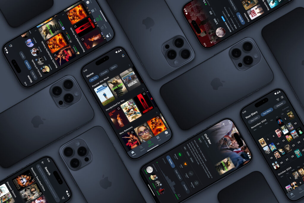
Letterboxd Redesign
Improving the overall user experience through an extensive UI redesign
Workflow
- Research
- Synthesis
- Design
- Usability Testing
Team
- Levin Schulz
Time
- 2024
- 5 Weeks
Context
- Personal Project

Metrics
Business
- Revenue Growth
- Customer Lifetime Value (CLV)
- Customer Acquisition Cost (CAC)
- Conversion Rate
Users
- Customer Satisfaction (CSAT)
- User Engagement
- Net Promoter Score (NPS)
- Task Success Rate
Research
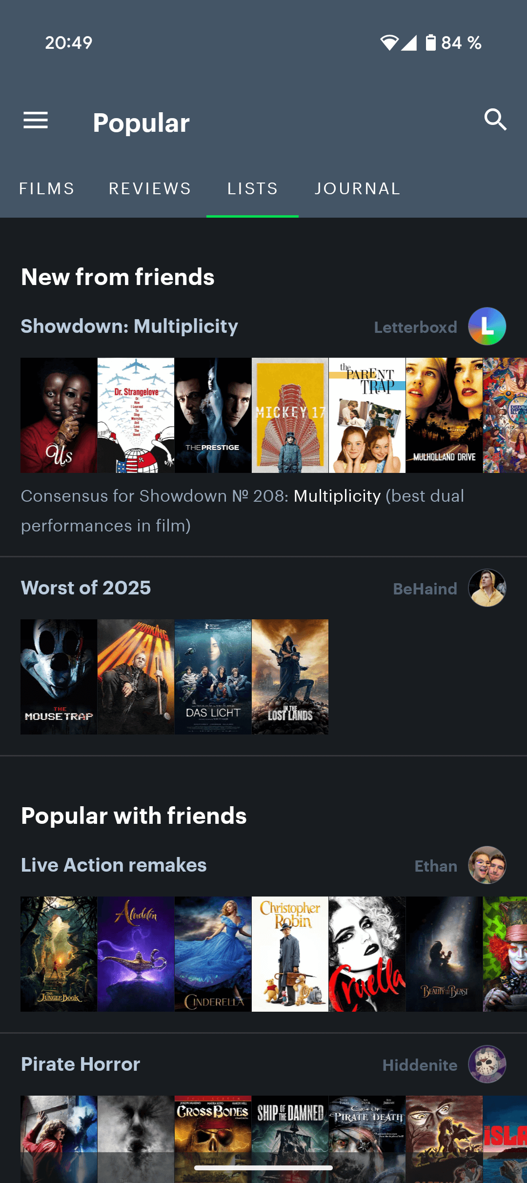
As a passionate Letterboxd user, my goal was to improve the app’s functionality, modernize its outdated user interface, and enhance the overall user experience. The redesign process began with a clear definition of the problems, based on both personal insights and extensive user research. I conducted a quantitative analysis of 23,000+ Play Store reviews and gathered additional feedback.
The most common pain points included confusing navigation, the absence of an intuitive bottom navigation bar, a lack of visual hierarchy, and missing personalization and filtering features. Based on these findings, I implemented an iterative design process: through sketches, wireframes, alternative user flows, and multiple screen prototypes, I explored various solutions and refined the design to create a more user-centered and functionally improved app experience.
The UX is in need of optimization. Too many steps to manage your own films/lists. From time to time the app crashes on the app start page. Password and username are not suggested from the saved chrome passwords, 2FA via fingerprint would also be nice. Ergo: to become a pro user this is not yet sufficiently optimized
The content is good, but the app itself is not well developed & maintained. Not very many features and very outdated appearance.
Problem definition
Identified Issues
- Inefficient navigation and hidden core features
- Lack of visual hierarchy leading to overlooked information
- Outdated UI deterring user engagement
- Absence of personalized recommendations
Objectives
- Streamline user navigation with intuitive design
- Enhance visual hierarchy for better information accessibility
- Modernize the UI to increase user retention
- Implement personalized content suggestions
Design Process
To tackle the identified usability issues and improve the overall user experience, I followed an iterative, user-centered design approach. I began by sketching out early concepts and exploring various layout ideas through low-fidelity wireframes. This allowed me to quickly test different information structures and interaction models.
From there, I developed multiple user flow variations to optimize navigation and ensure that core features were more accessible. With each iteration, I refined the interface based on usability best practices and user expectations.
High-fidelity prototypes were then created to visualize the final look and feel of the redesigned app. These prototypes helped to test interactions, validate design decisions, and gather feedback on the overall functionality and visual appeal. Throughout the process, I focused on creating a streamlined, intuitive, and aesthetically modern user experience tailored to the needs of both new and returning Letterboxd users.
Watch-listing and logging a movie
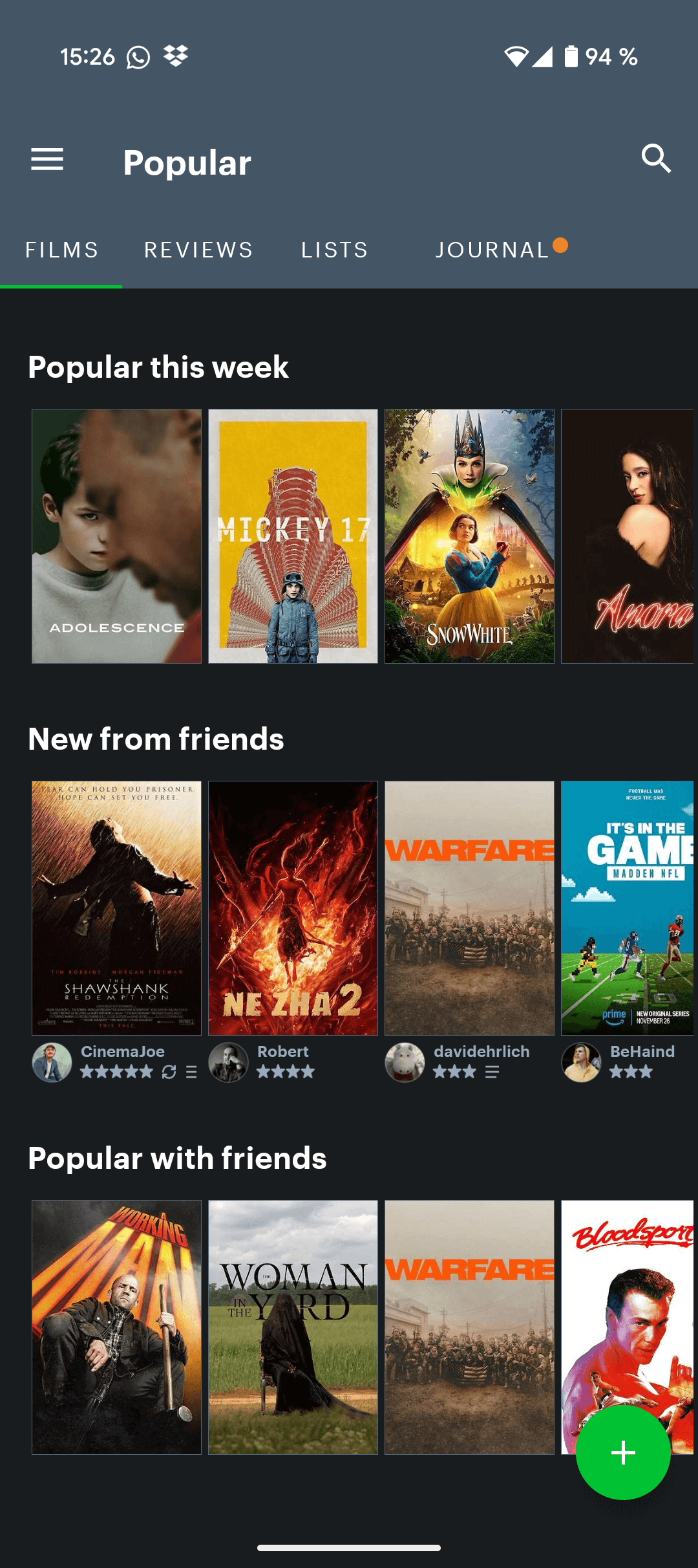
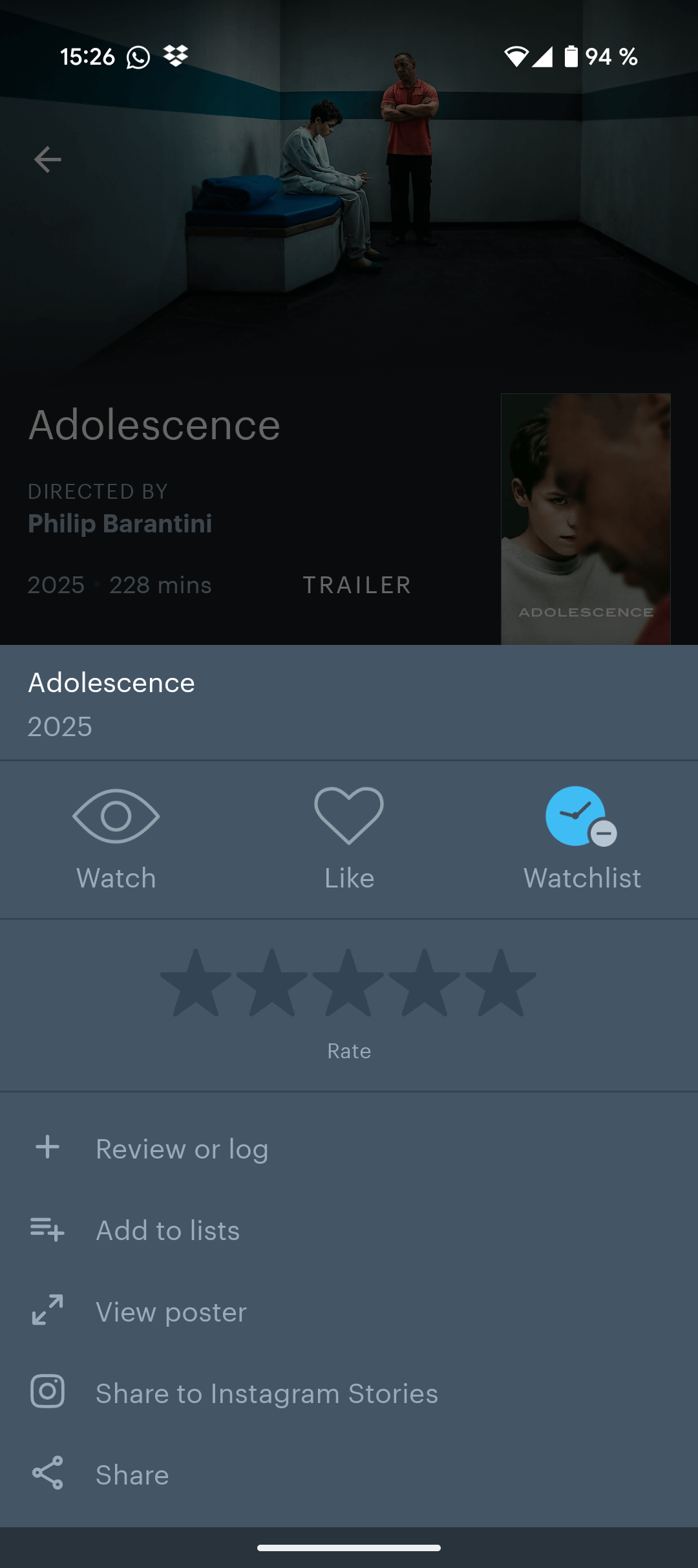
Despite a robust database with millions of movies, the core functionalities of watchlist management and watch logging were hindered by inefficient user flows. Specifically, adding movies to the watchlist required excessive steps, forcing users to navigate to individual movie screens or manually search, rather than providing a direct bookmarking option from the home screen movie cards.
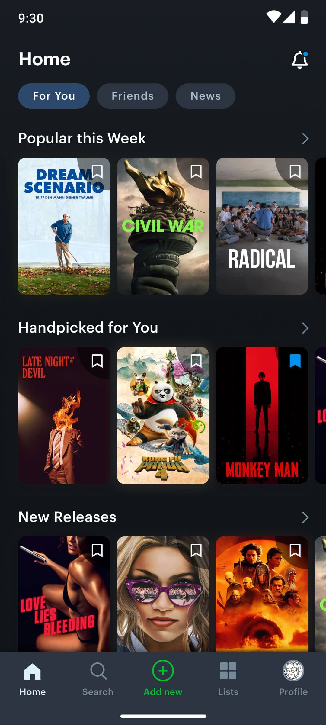
New user flow of watch-listing a movie
A new bookmark icon enables users to add a film to their watchlist directly from the home screen.
A new bookmark icon enables users to add a film to their watchlist directly from the home screen
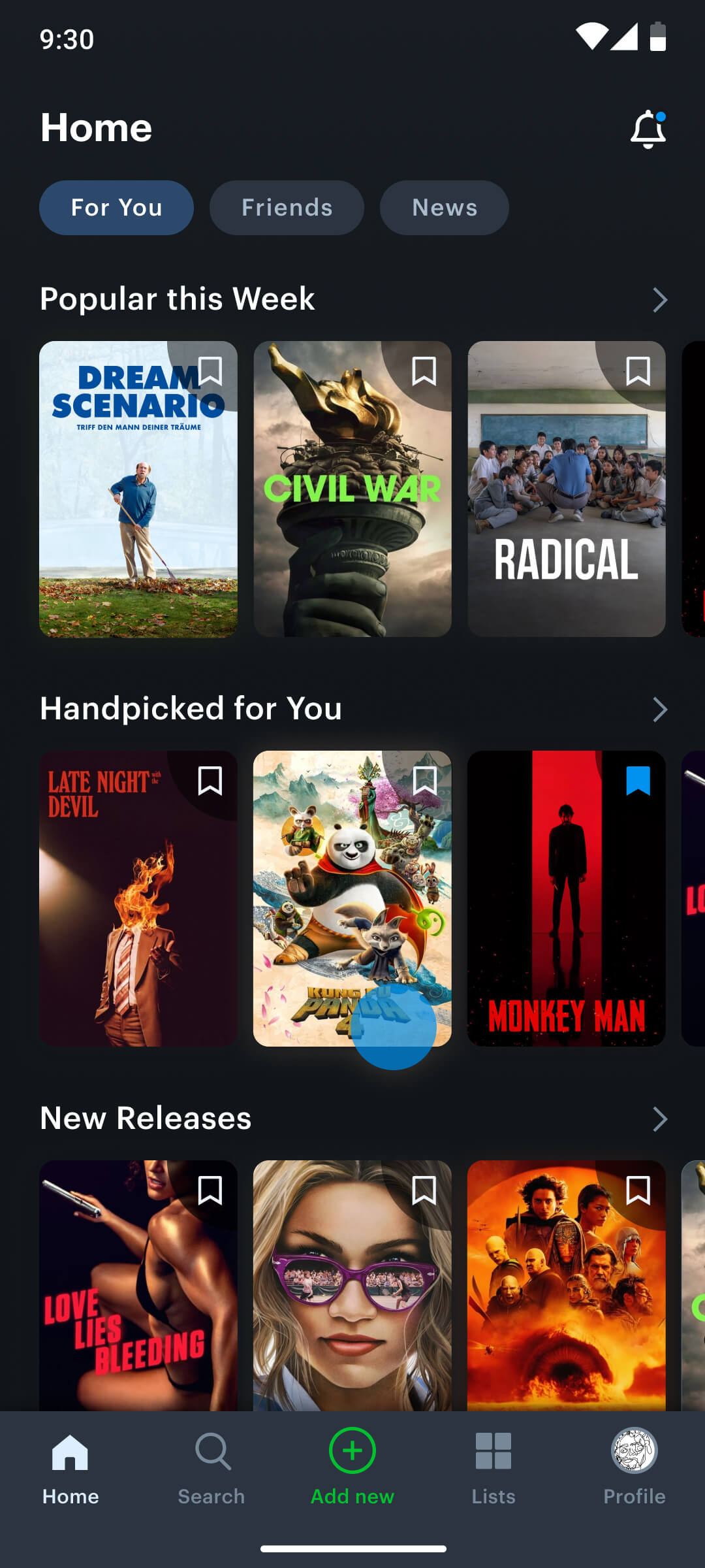
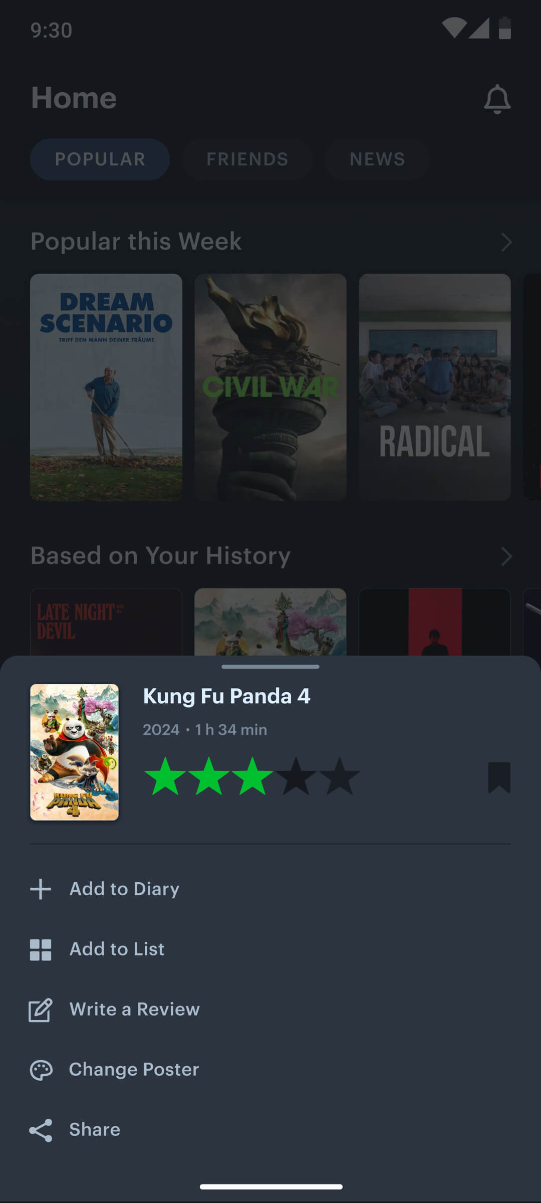
New user flow of logging a movie
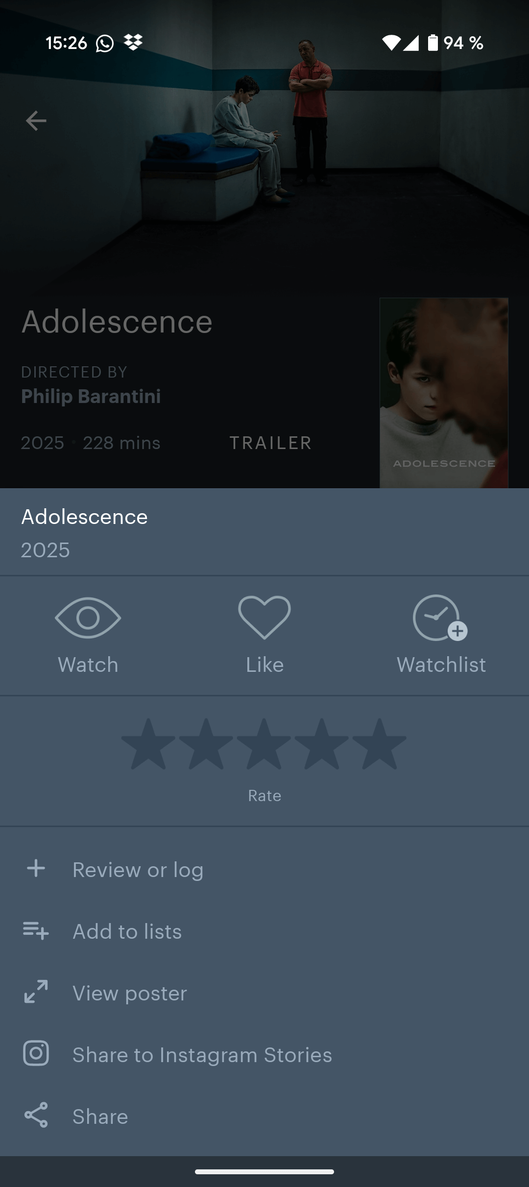
A quick menu enables users to rate, watchlist, log, add to diary, review, customize or share a movie by simply long-pressing it.
A quick menu enables users to rate, watchlist, log, add to diary, review, customize or share a movie directly from the home screen
Home screen
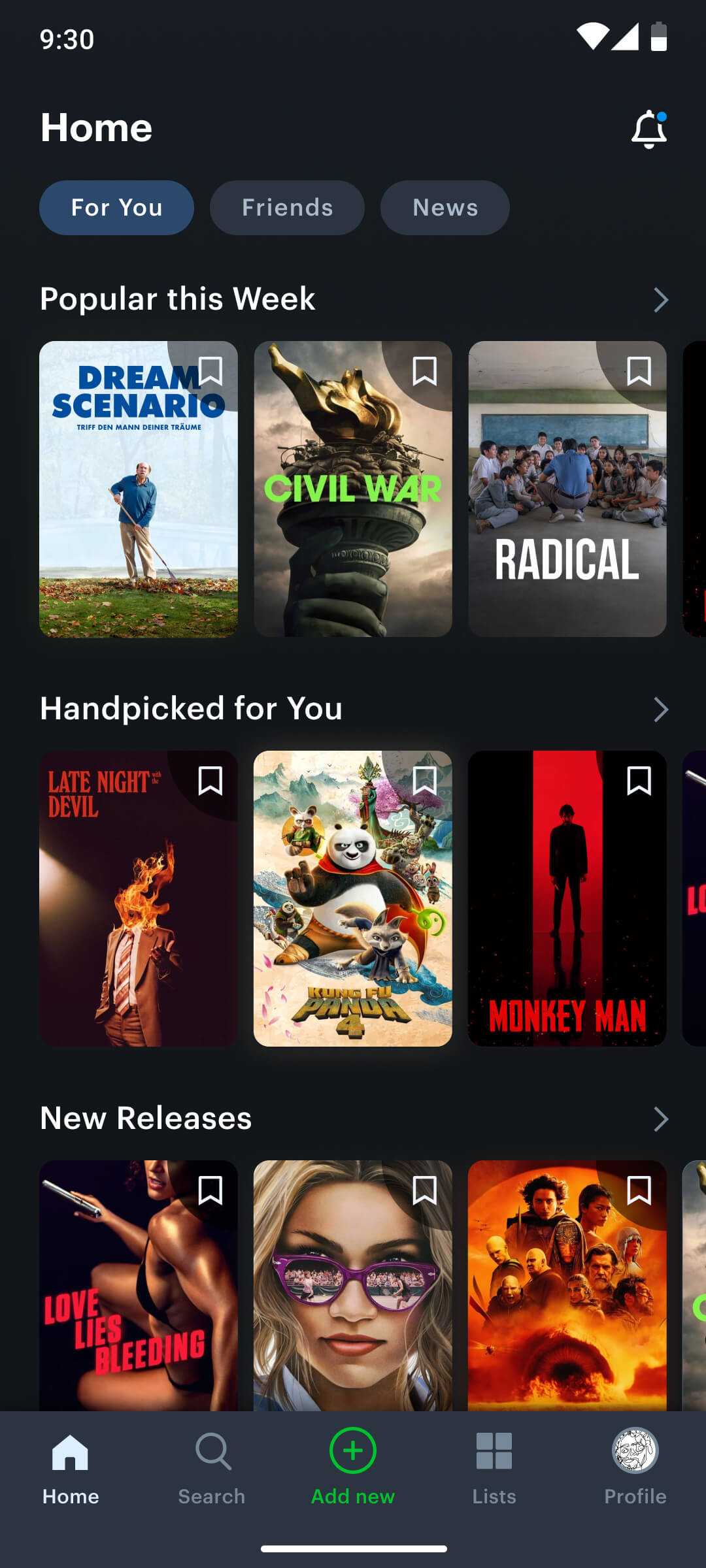
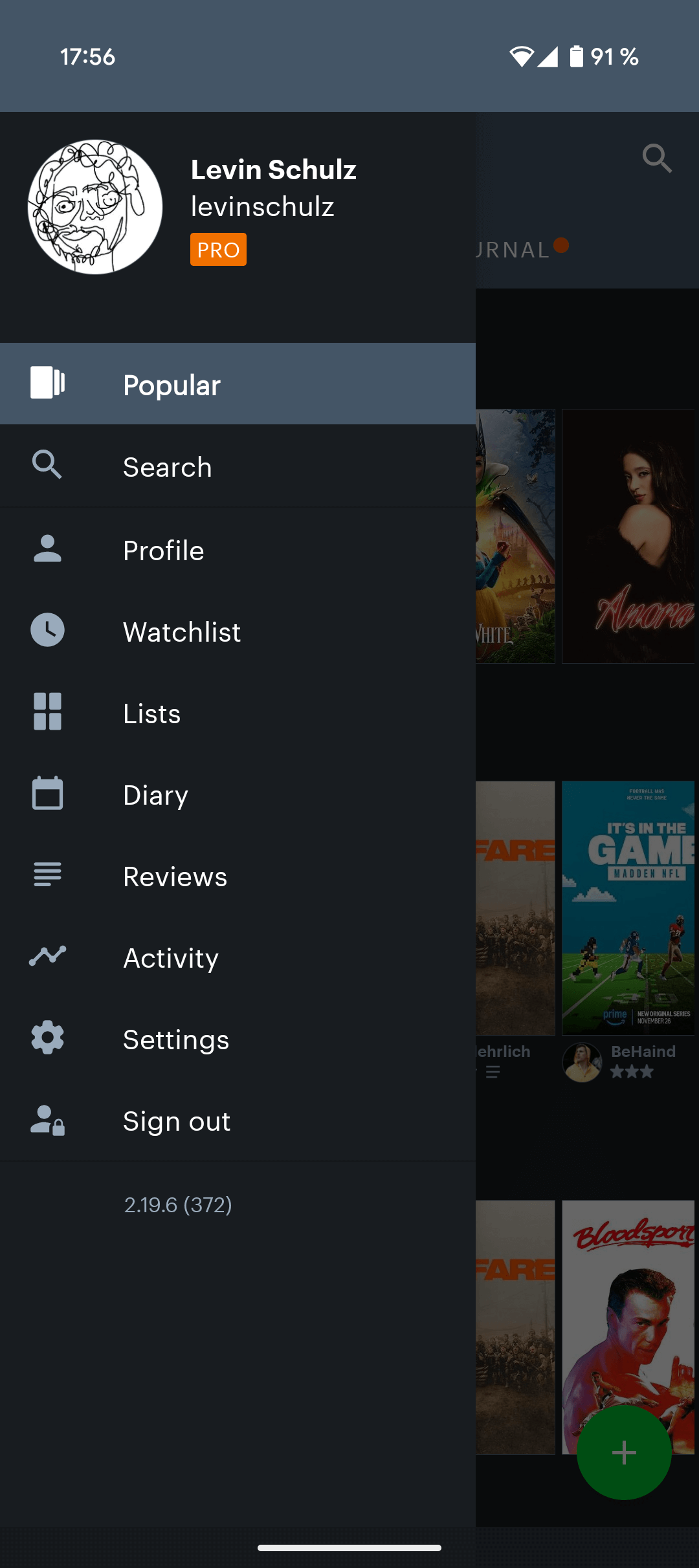
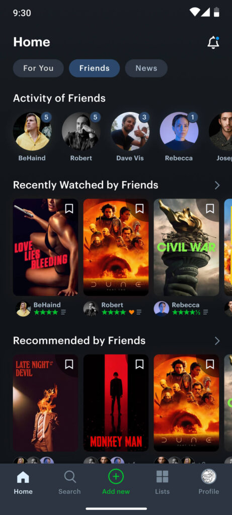
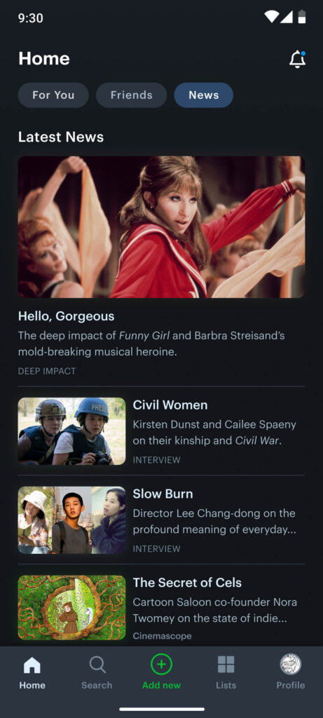
The original home screen suffered from an outdated, inefficient, and inaccessible interface that hindered exploration and limited user engagement. As the entry point of the app, it failed to guide users effectively or showcase its core strengths, such as personalized content and social features. To address this, I restructured the home screen with a clear focus on usability and discoverability.
I introduced a bottom navigation bar to simplify access to key features and relocated the primary CTA (“+”) for improved interaction. The new layout organizes content into three intuitive tabs: “For You”, offering tailored movie recommendations based on watch history; “Friends”, highlighting activity and suggestions from people the user follows; and “News”, curating editorial content from critics and journalists. This redesign prioritizes personalization, social engagement, and a seamless navigation flow—transforming the home screen into a dynamic and user-centric starting point.
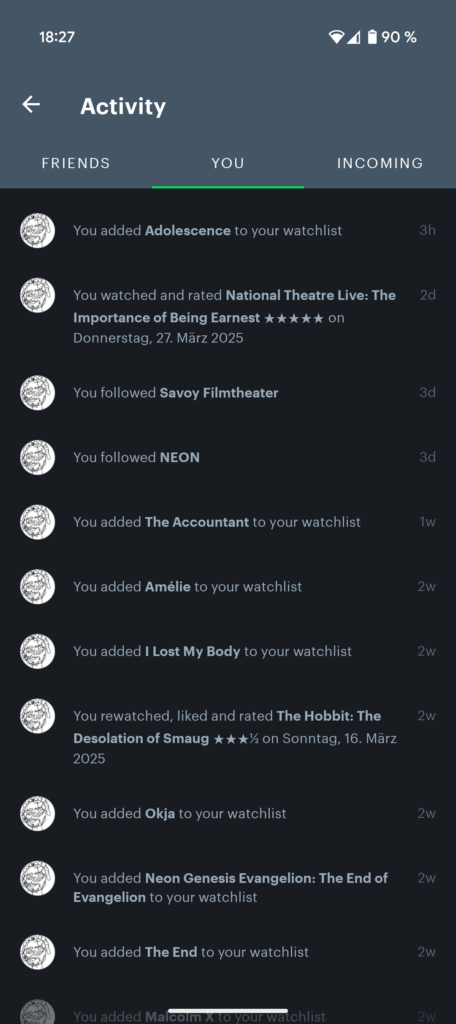
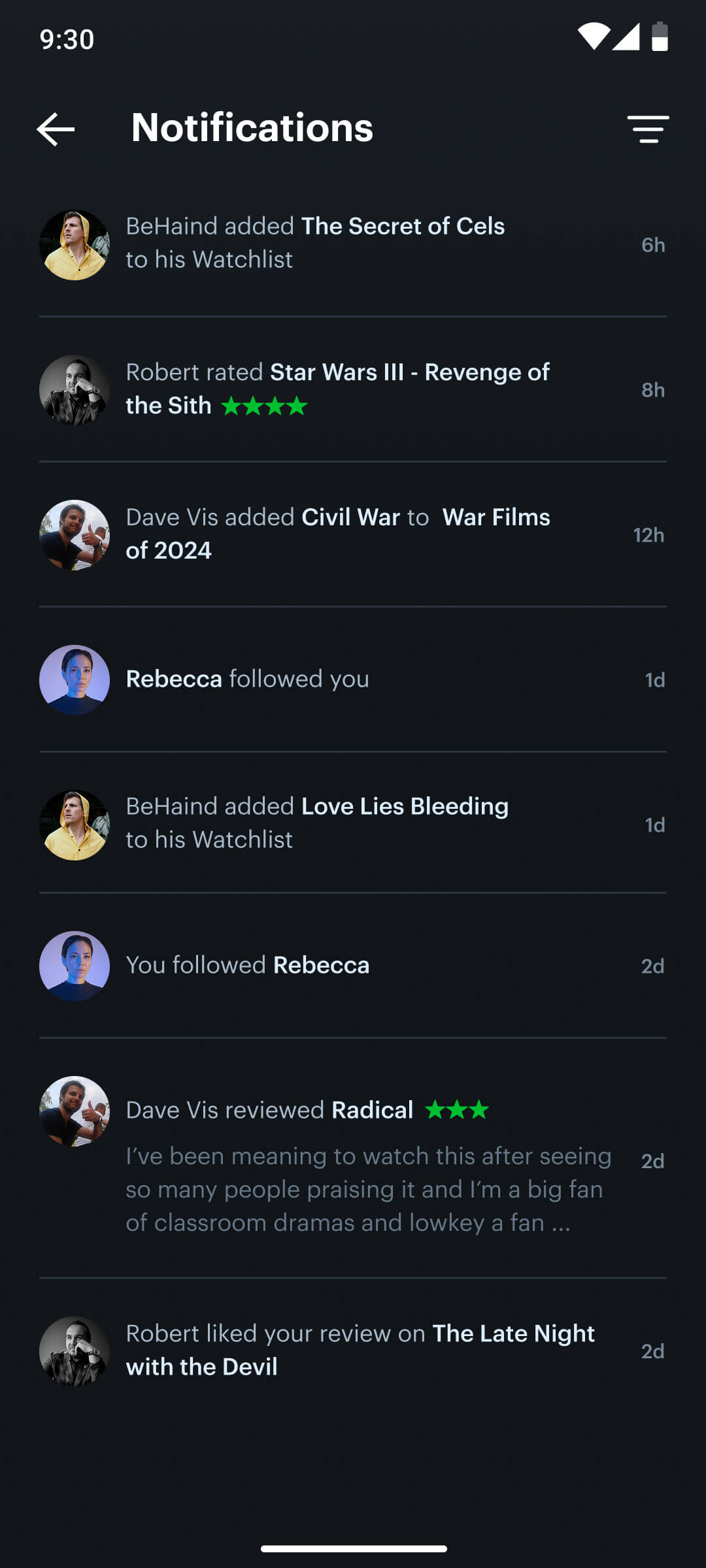
Activity tab
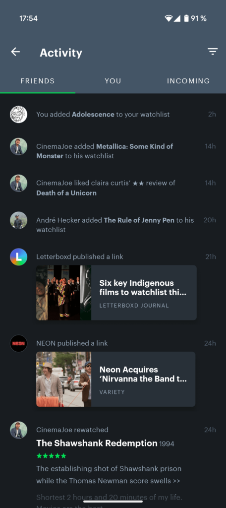
To streamline the activity tab, I combined the sub-sections into a single new “Notification” area, aiming for improved clarity and user comprehension. I removed the “You” section, which displayed the user’s personal activity log, as it duplicated information and detracted from the core notification/activity functionality.
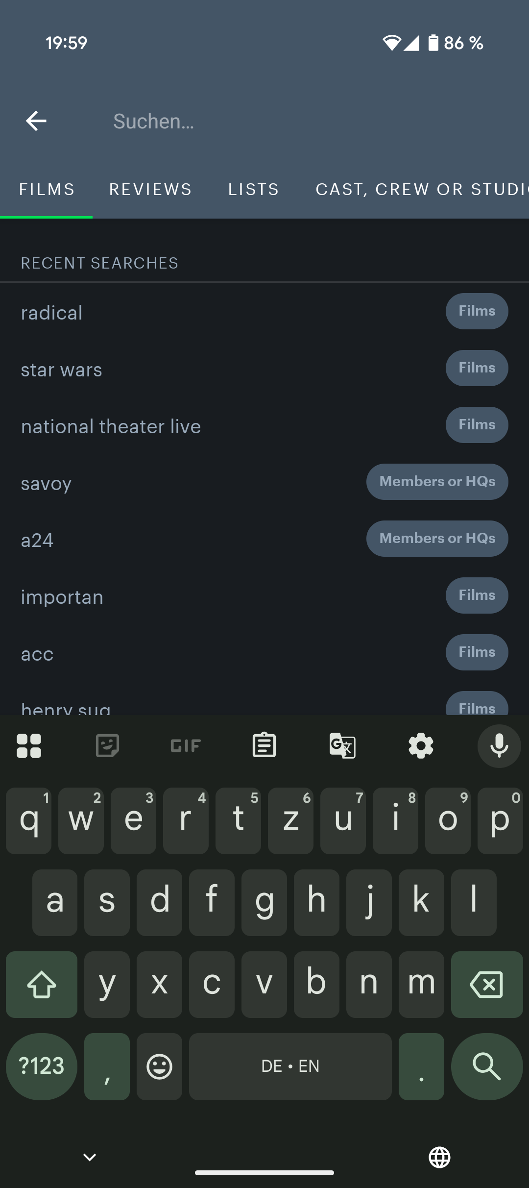
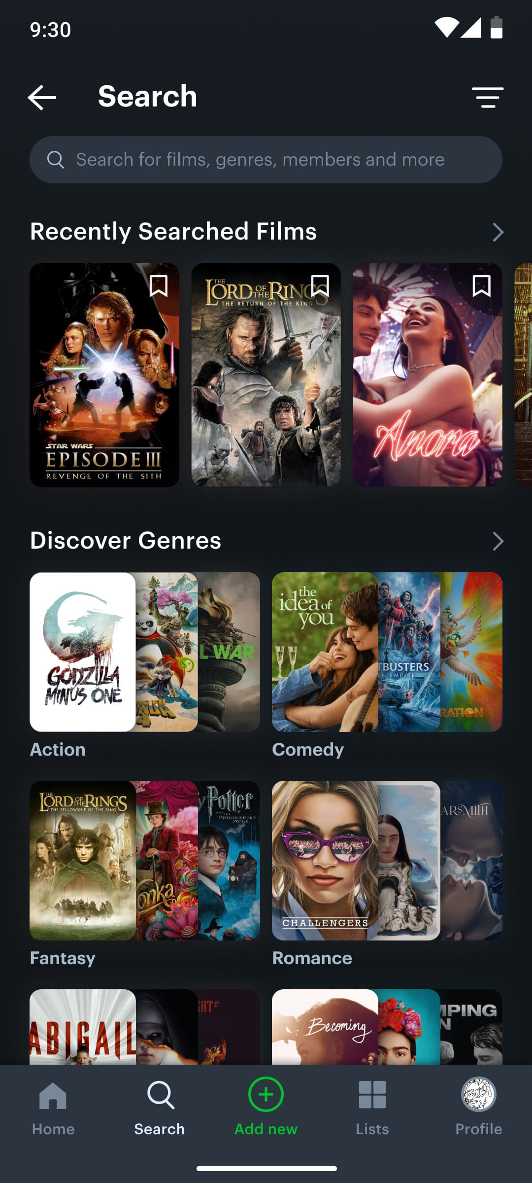
Movie search
The original app’s search functionality was limited to title-based queries, making it difficult for users to discover new films through broader categories like genre—a fundamental feature for any movie platform. This lack of exploration options significantly restricted user engagement and content discovery.
To solve this, I integrated a dedicated search section into the bottom navigation, placing a stronger focus on exploration. The redesigned search experience allows users to revisit their search history and browse an extensive selection of genres and subgenres, making film discovery more intuitive, personalized, and engaging.
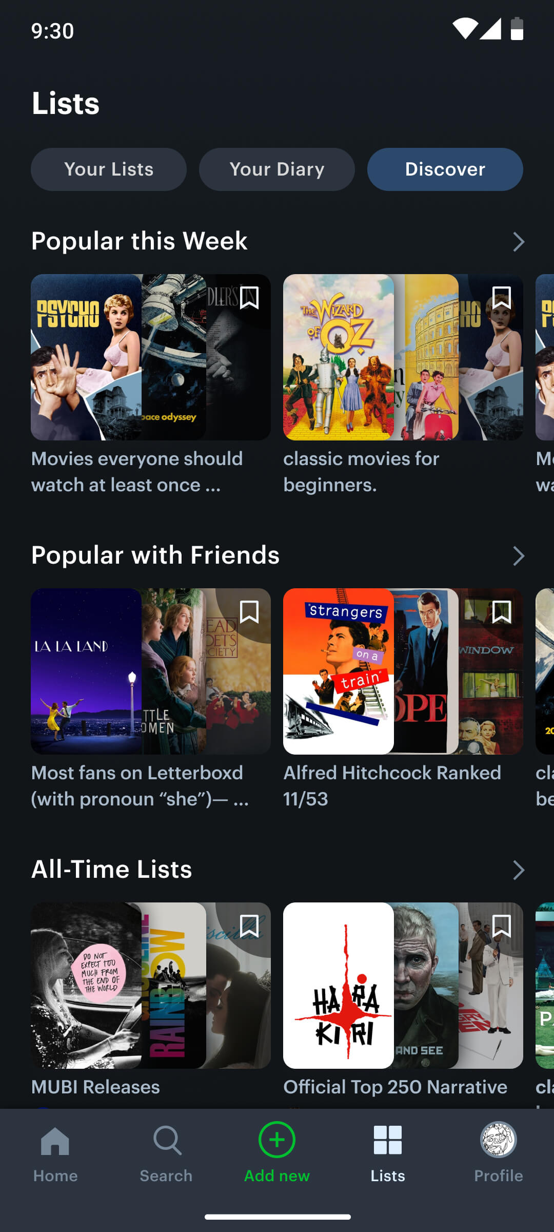
Lists & watchlist
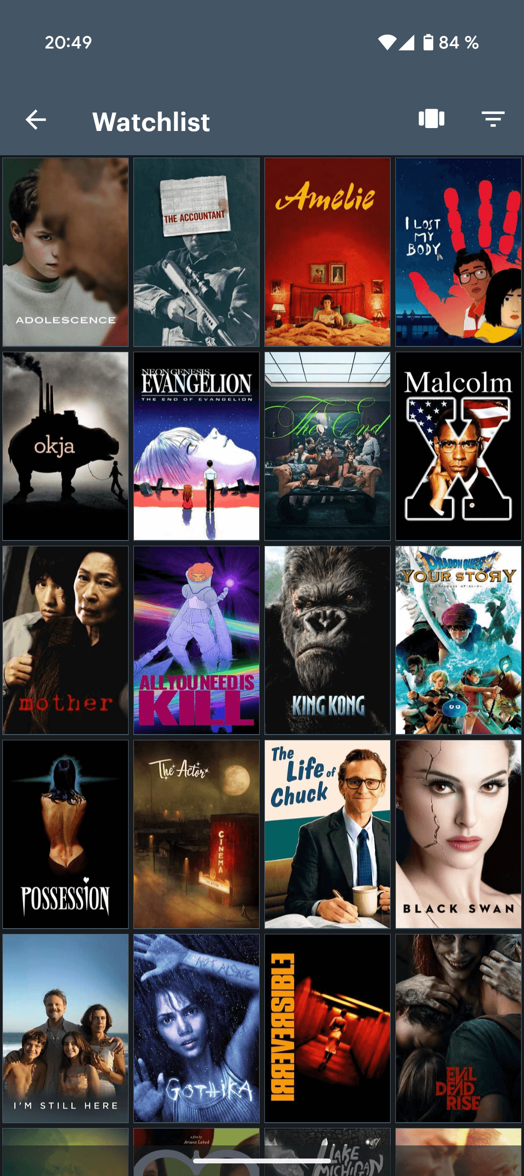
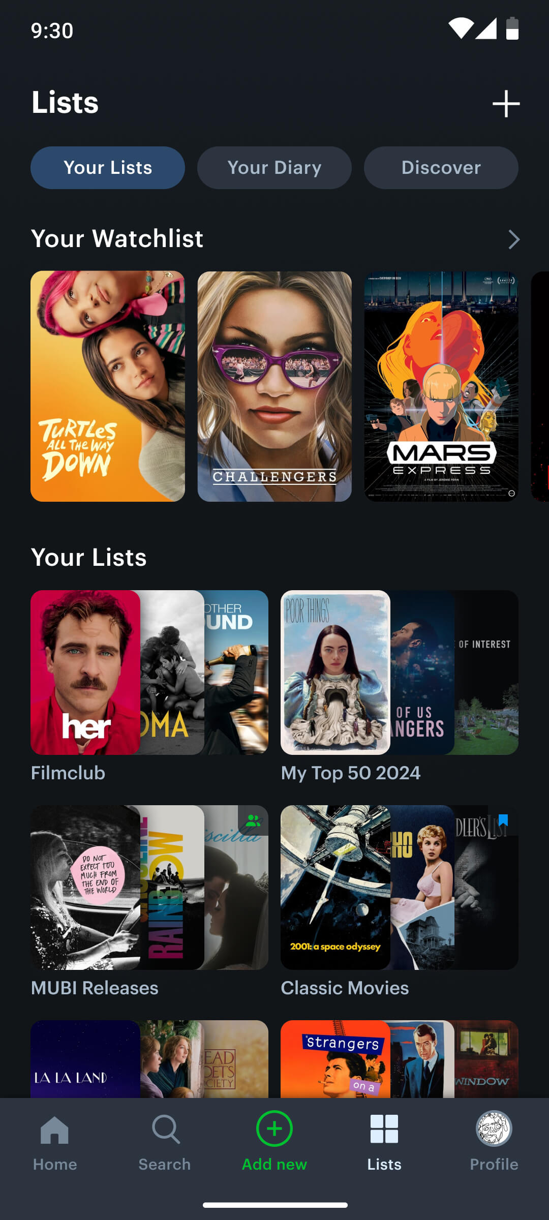
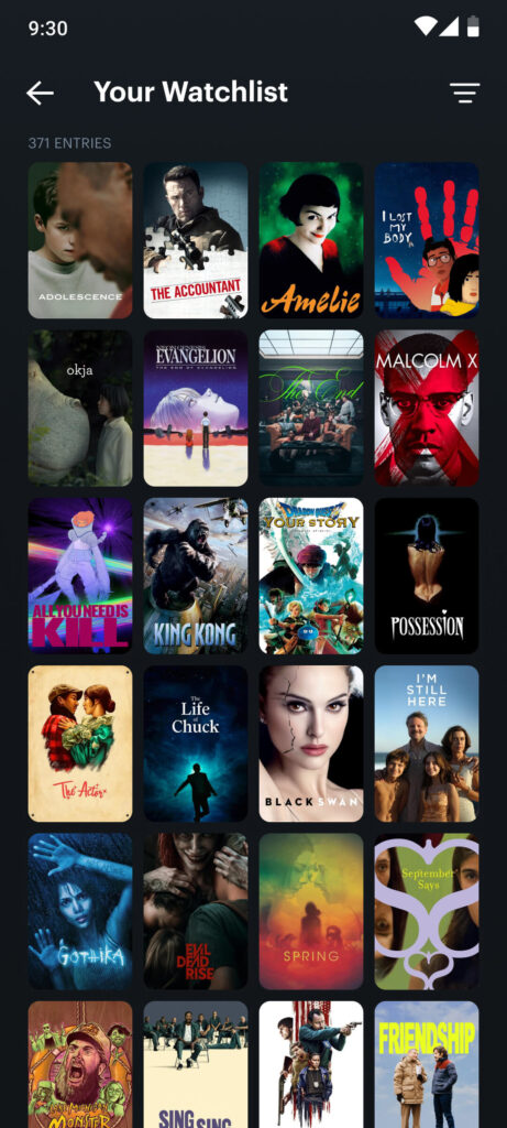
A key feature of the app—the watchlist—was hidden in a sidebar, making it difficult to access and thus underused by many users. Additionally, the app lacked the ability to save curated movie lists, which limited its potential as a discovery and planning tool.
To address these issues, I repositioned the watchlist and user-generated lists within the bottom navigation, ensuring quick, one-tap access to these essential features. The new, unified section allows users to easily manage their saved movies, organize personal watchlists, and explore curated lists from the wider community—enhancing both usability and content discovery.
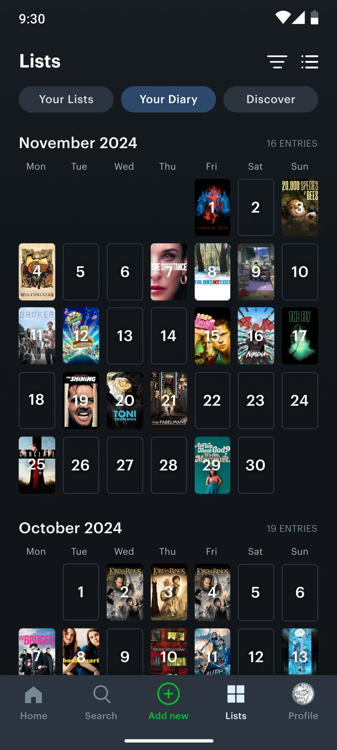
Diary
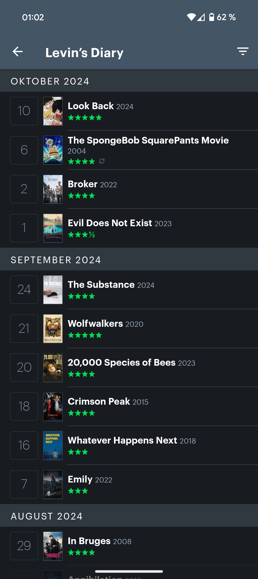
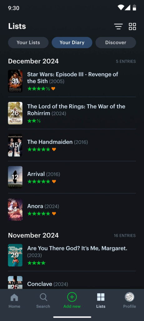
To provide a more user-friendly and visually engaging way to track watch history, I redesigned the diary screen by integrating a calendar view. Instead of displaying watched movies in a plain list format, the new design presents them in a photographic calendar layout, where each movie is represented by its poster on the corresponding date. This not only makes the diary more visually appealing, but also helps users intuitively reflect on their viewing habits over time. The design encourages deeper engagement by transforming simple data into a more memorable and personal timeline of movie experiences.
User profile
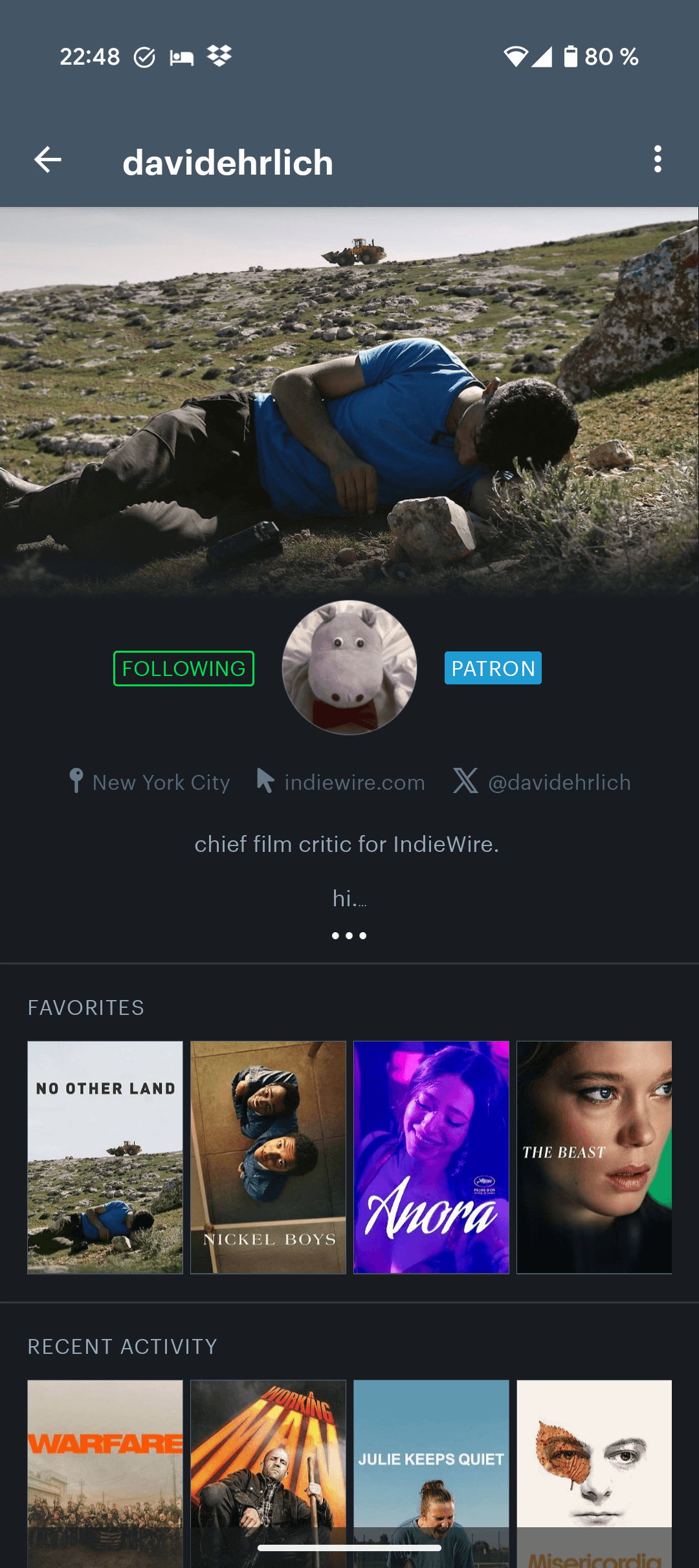
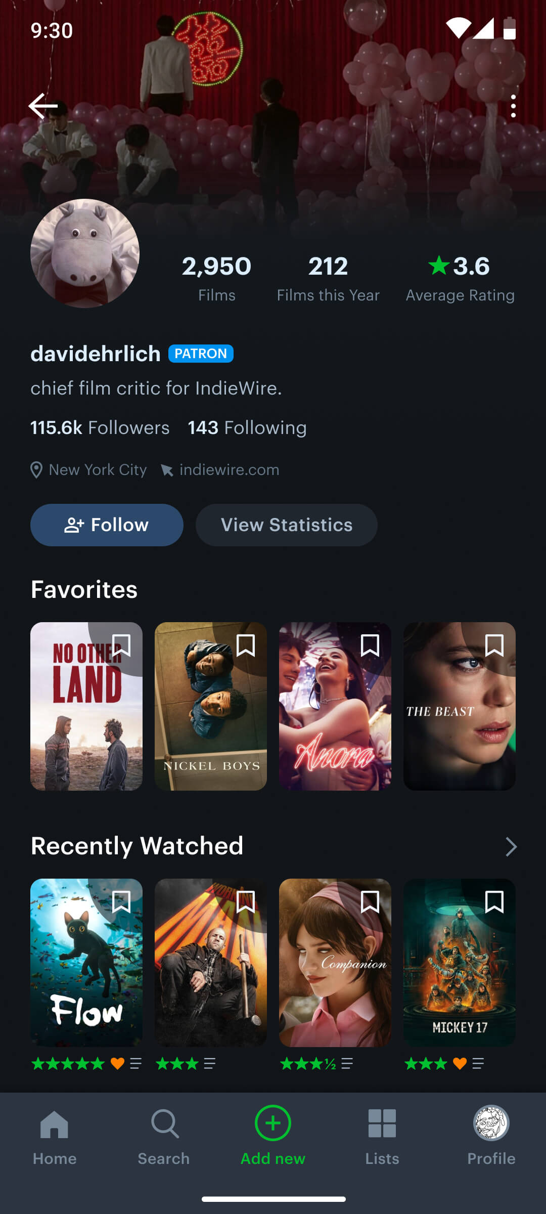
The original user profile suffered from a cluttered and unstructured layout, disrupting natural reading flow and making it difficult for users to focus on key information such as films watched, followers, and average ratings. This led to cognitive overload and weakened the social potential of the platform.
To solve this, I streamlined the top section of the profile to highlight only the most essential metrics—total films watched, films watched this year, and average rating—ensuring immediate clarity. Additionally, I restructured the layout to follow modern design conventions for profile pages, making the experience more intuitive and visually digestible, while reinforcing the app’s social dimension through clearer data visualization.
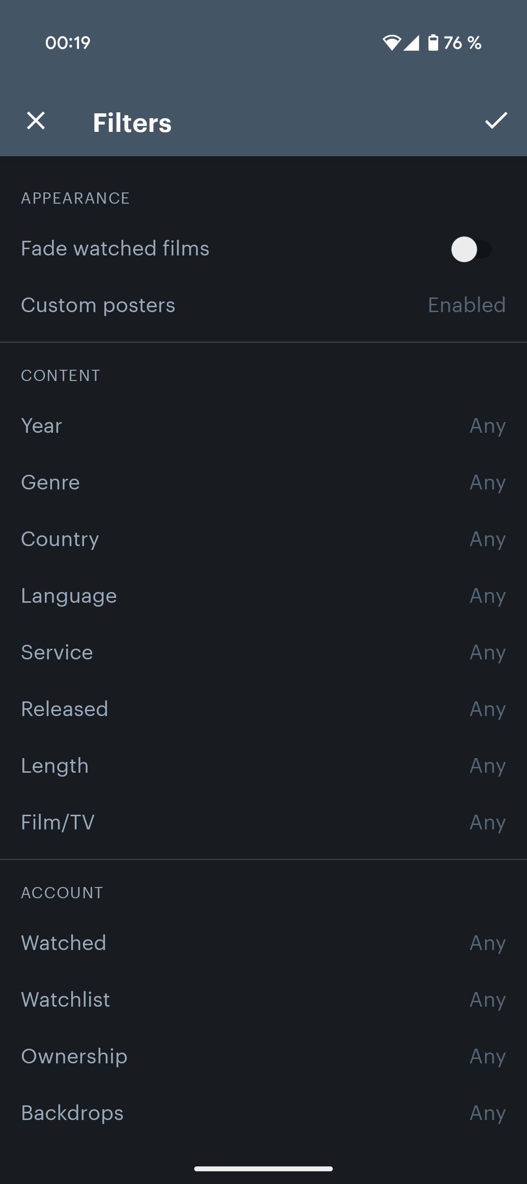
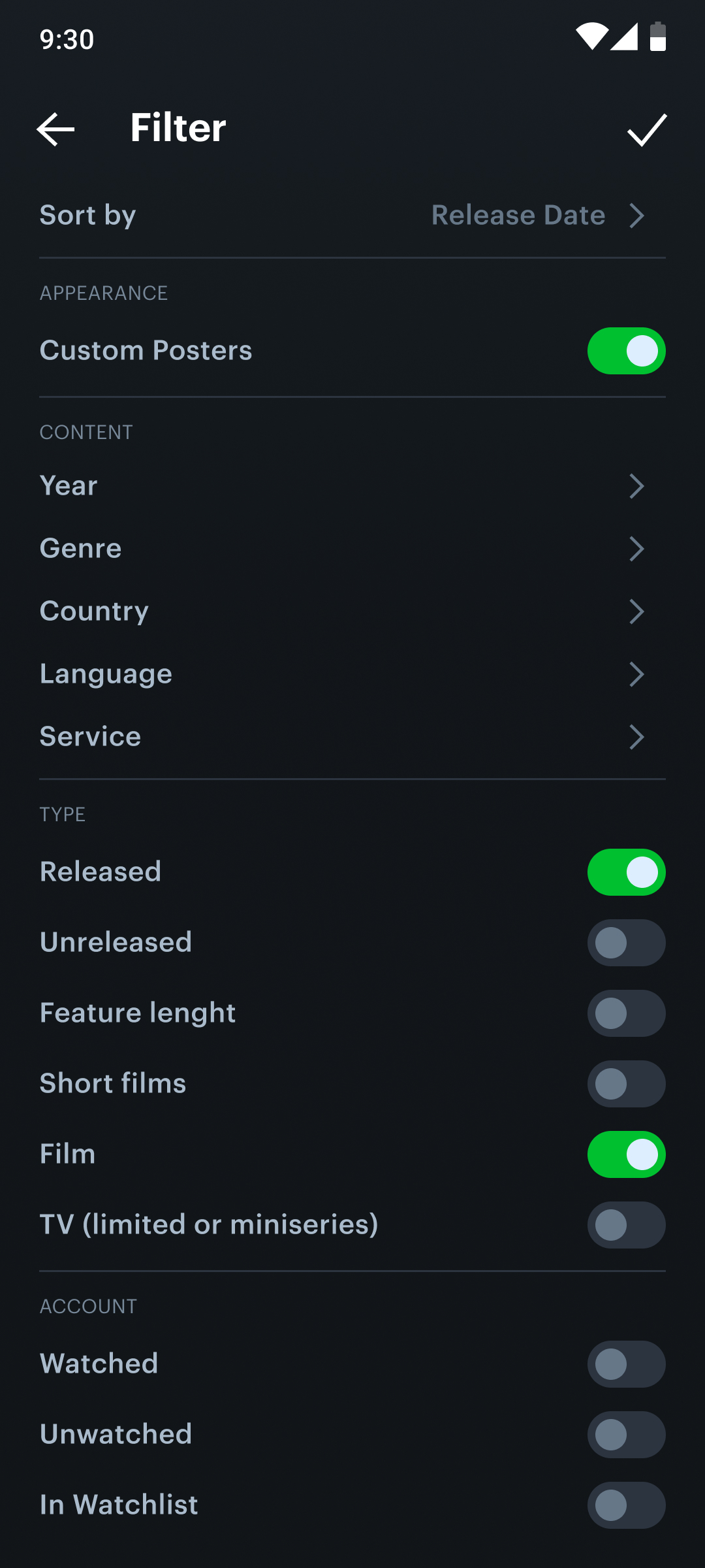
Filter modal
I optimized the filter modal’s interface for improved user-friendliness, making option selection more straightforward. Additionally, I introduced toggles within the list items to facilitate personalized filtering.
Movie screen
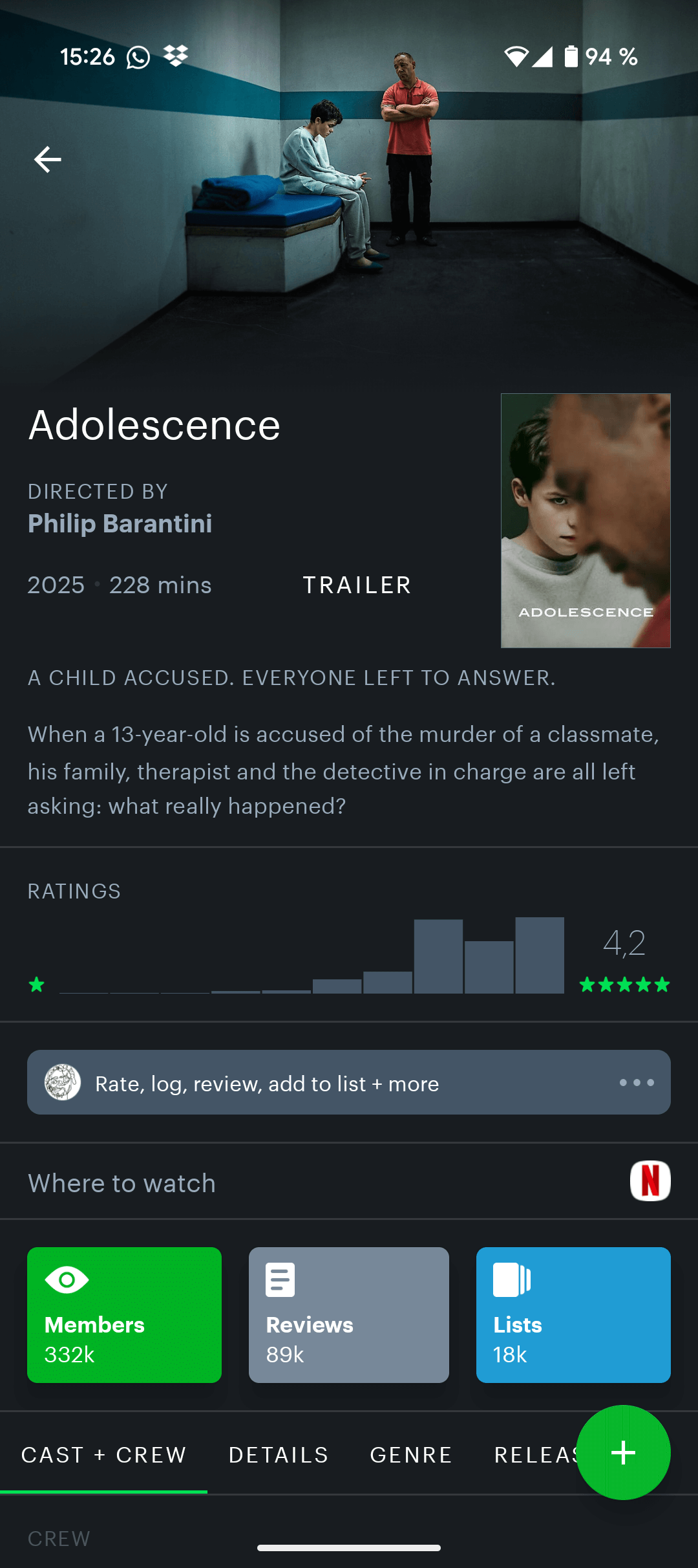
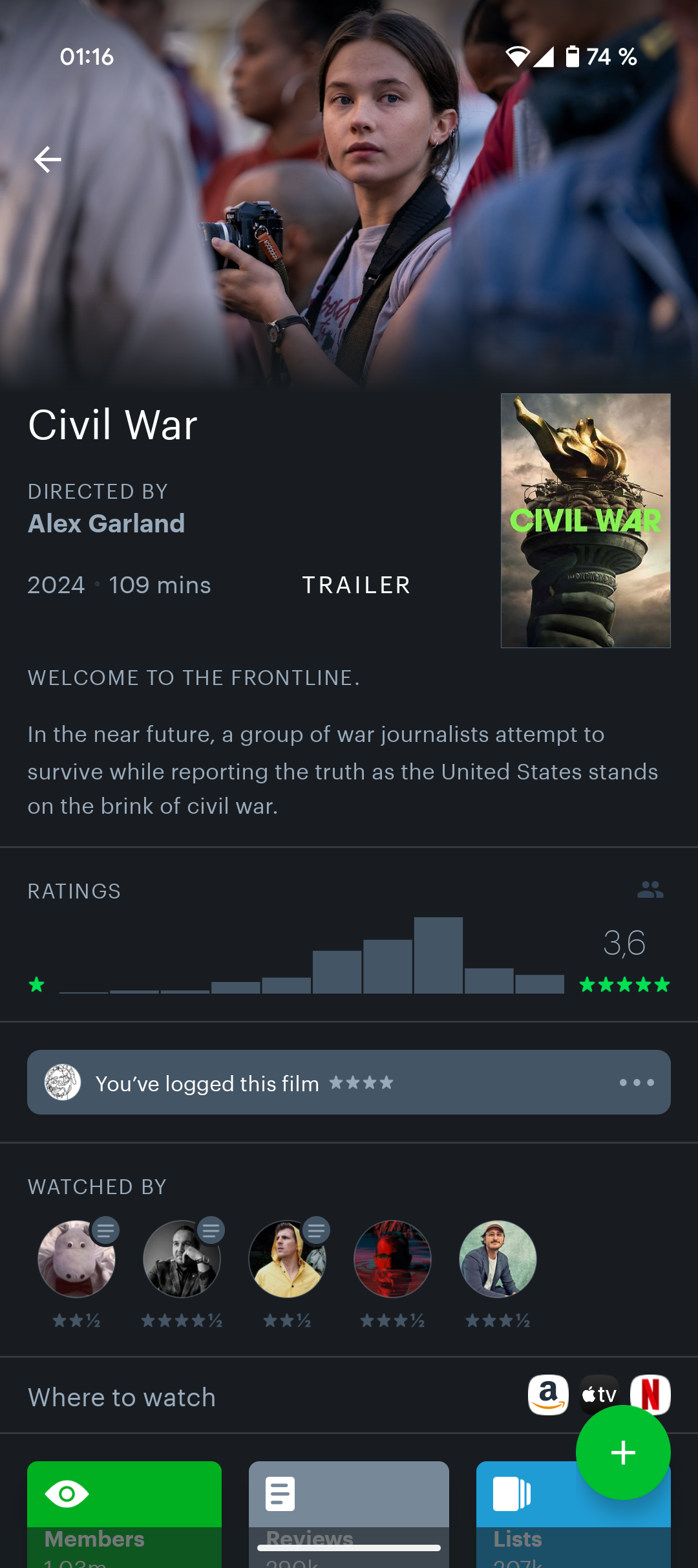
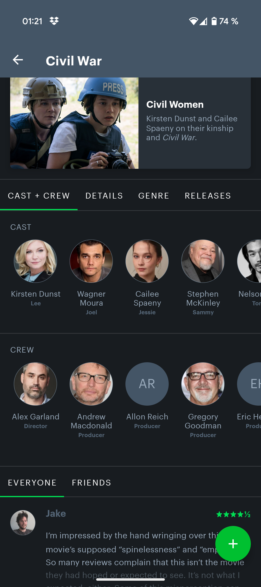
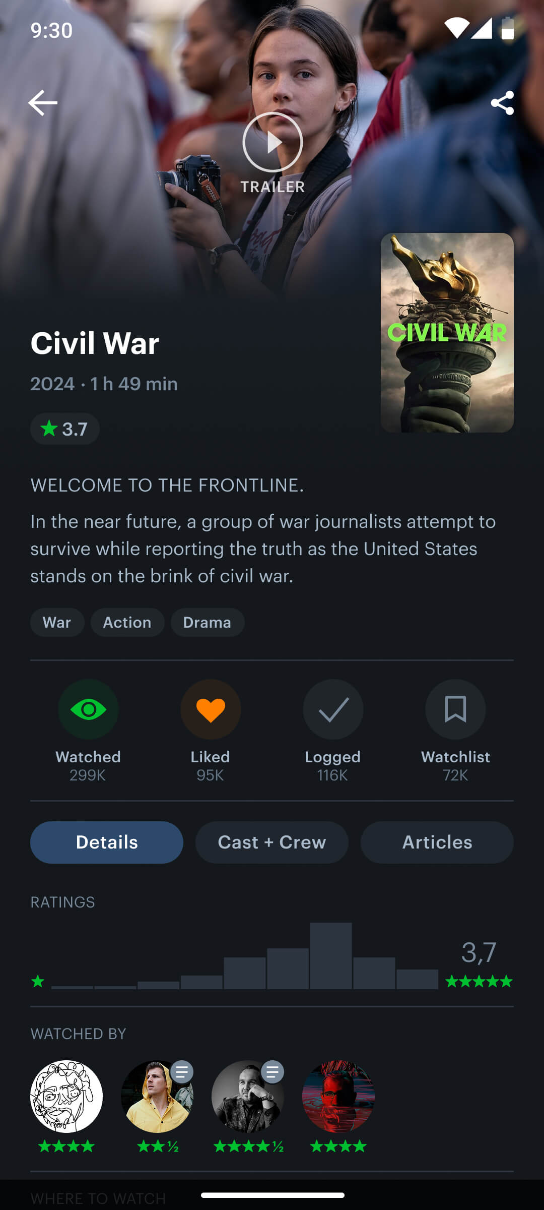
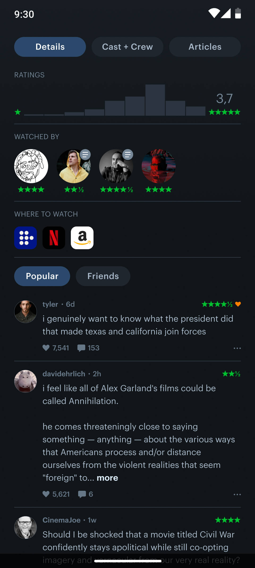
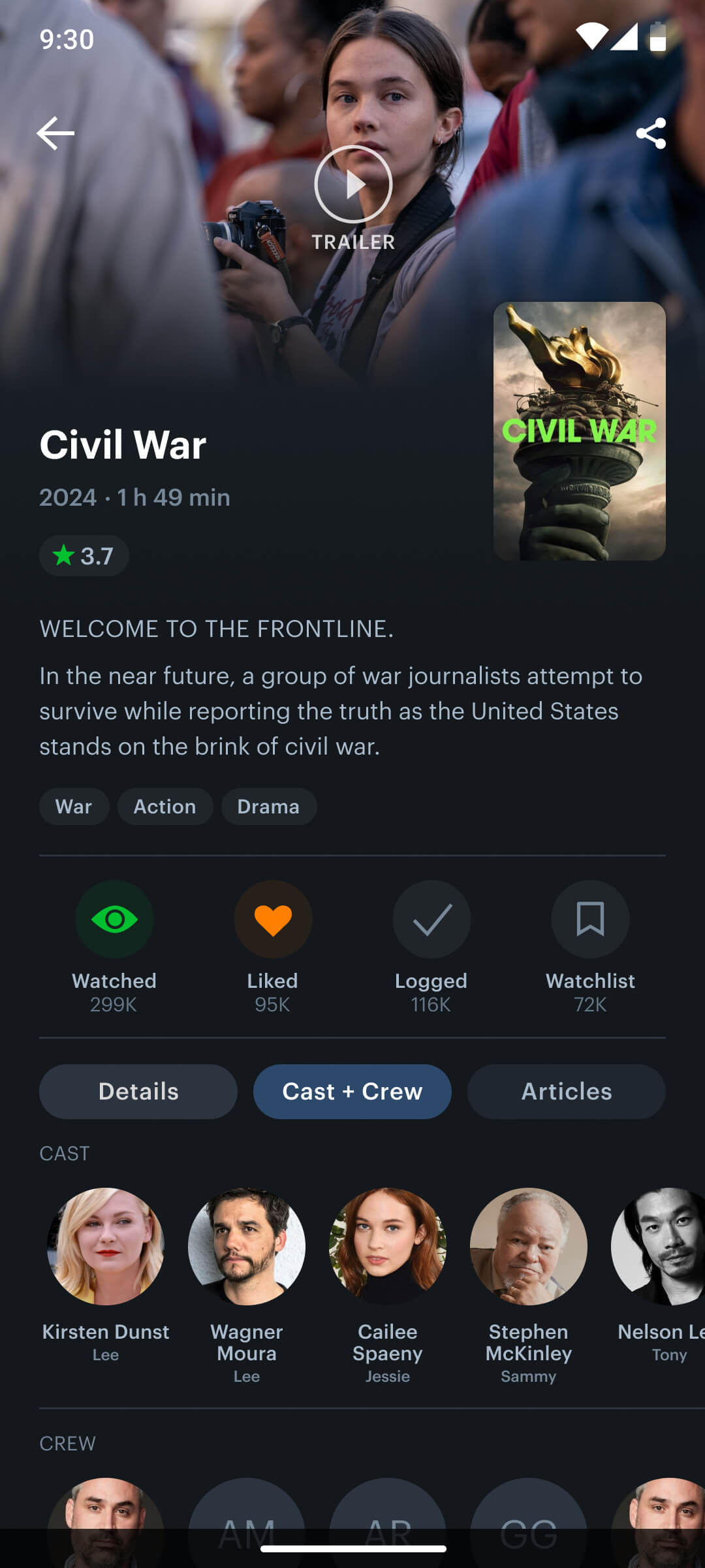
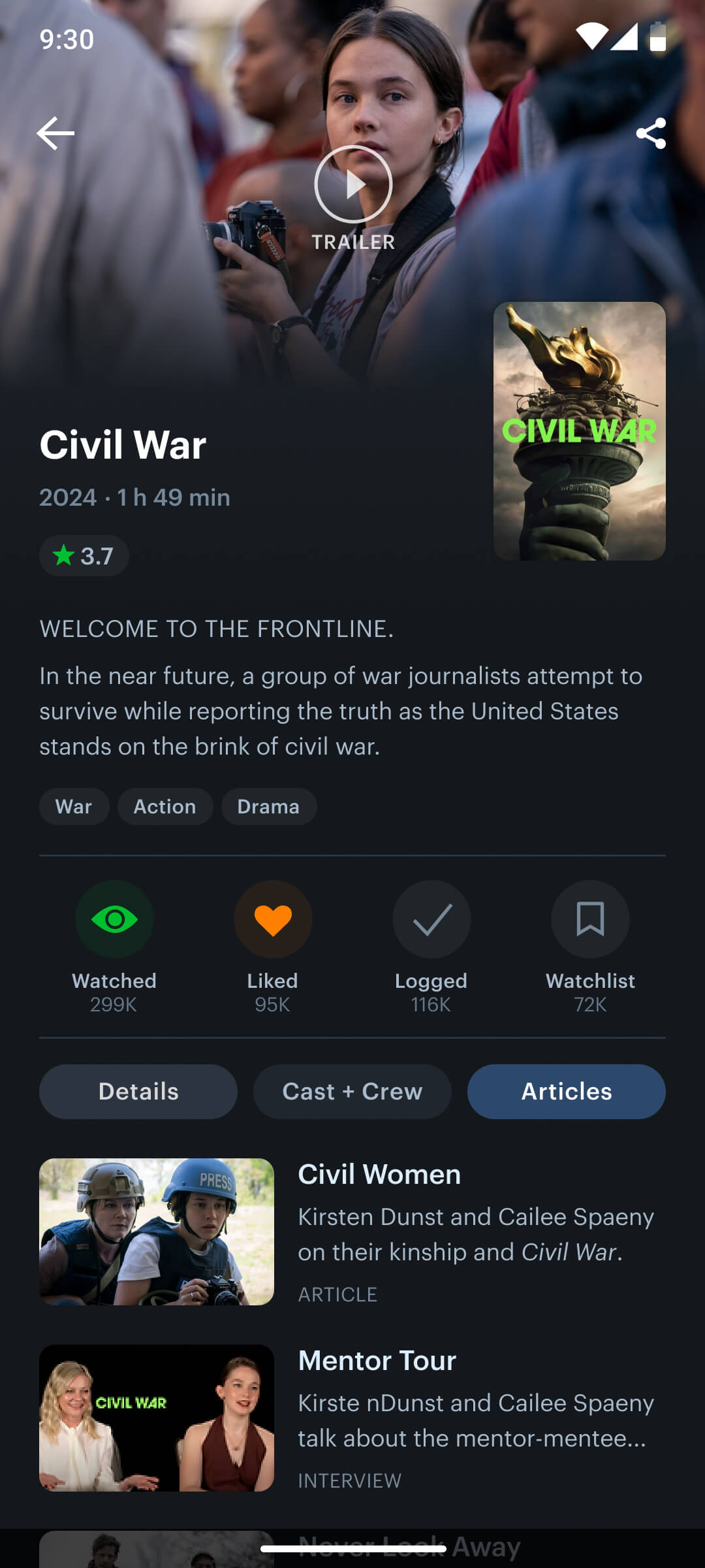
Redesigning the movie details screen posed a key challenge, as it required careful refinement of each element to establish a clear visual hierarchy and deliver an engaging, informative experience. I conducted research on leading movie platforms to identify familiar interaction patterns, then adapted these insights to meet the specific expectations of the Letterboxd user base.
To streamline user flow and minimize friction, I replaced the outdated modal system with direct action buttons for logging, liking, rating, and adding films to the watchlist. This made core interactions faster and more intuitive, while preserving the depth and richness of the content.
Login screen
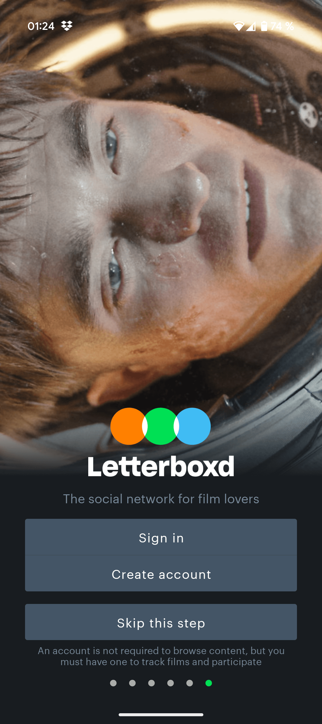
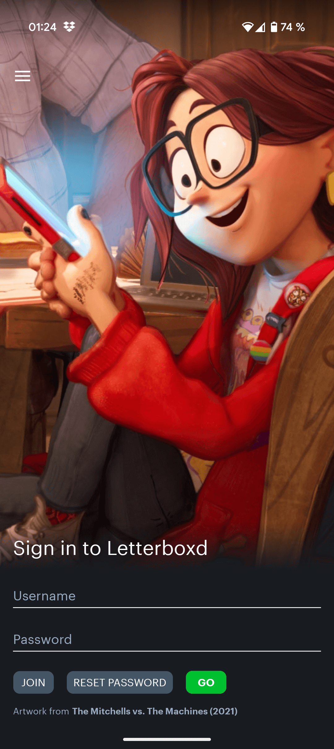
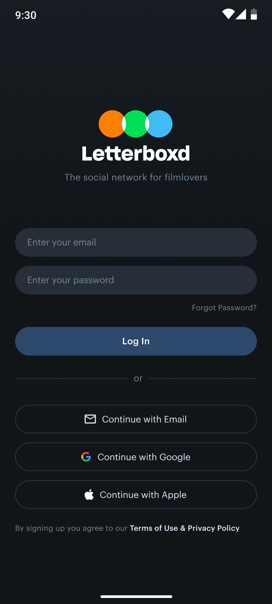
To streamline the onboarding experience, I consolidated the two-step login process from the current design into a single, unified login screen. This reduction in steps simplifies the user flow, minimizes friction during sign-in, and speeds up access to the app’s core features. By combining login and registration options within one clear interface, the new design enhances usability—especially for first-time users—and reflects modern best practices in mobile UX.
Conclusion & Learnings
Redesigning Letterboxd allowed me to merge my passion for film with a user-centered design approach to solve real usability challenges. By combining personal experience with thorough research and iterative prototyping, I was able to reimagine the app as a more intuitive, modern, and engaging platform that better serves both new and returning users.
Throughout the project, I focused on simplifying navigation, enhancing discoverability, and creating a more cohesive visual language. Key improvements such as the bottom navigation bar, a personalized home screen, and a redesigned diary view contributed to a smoother and more meaningful user experience. I also introduced a more powerful search function and streamlined interactions for core tasks like logging, rating, and watch-listing films.
This project not only sharpened my skills in interface and interaction design, but also deepened my understanding of how thoughtful UX decisions can directly impact user satisfaction. Most importantly, it taught me the value of designing with empathy—solving problems not just for aesthetics, but for real human needs.
